Knowledge Hub revamp
Circle Economy
In house product
Time
July 2025-Feb 2026
Miro
Granola AI
Maze
Sophia Chou: Product Design & Researcher
Lauren Zemering: Product Design Lead
James Aung: Product Manager
Isfaaq Goomany: Dev Lead
Wazeer Chadun: Full Stack Developer
Mahima Ramgolam: Front End Developer
Knowledge Hub Revamp
Circle Economy
In house product
TIME
July 2025-Feb 2026
Figma
Miro
Granola AI
Maze
Sophia Chou: Product Design & Researcher
Lauren Zemering: Product Design Lead
James Aung: Product Manager
Isfaaq Goomany: Dev Lead
Wazeer Chadun: Full Stack Developer
Mahima Ramgolam: Front End Developer
Redesigned and integrated a circular economy knowledge platform into the broader Circle Economy website, aligning user journeys, information architecture, and visual systems across products to create a cohesive product ecosystem for sustainability professionals.
Built a strong scalable design foundation
Habit-building among designers and developers
Legacy tech meets brand fragmentation
Critical Security Risks
Technical Debt
Confusing brand identity
Create a secure, maintainable and scalable site architecture
Improve overall user experience
Increase Circle Economy website traffic through platform integration
*This goal emerged during the design process
We had to cut non-essential features to meet the CGR 2026 deadline.
To reduce dev time and improve integration, we leaned heavily on the brand of the circle economy website and created components that could be used widely across the whole ecosystem.
Since maintenance resources are low, we opted to use many of the systems already in use for the Circle Economy website. Streamlining the two platforms and making them robust enough to run with minimal oversight post-launch.
User interviews, past research deep dive, JTBD analysis
Contributors wanted more recognition for their work and ways to connect with others to expand their network. They also wanted a more efficient way to upload case studies.
Readers wanted to navigate content by relevant filters such as the industry or region. And they wanted to see more practical, on the ground case studies.
Circle Economy wanted to host and promote its own publications while also fostering an open platform for sharing circular practices.
We conducted an object-oriented UX (OOUX) mapping, the goal of which was to simplify the old architecture while creating a framework for our wireframes. We also developed detailed user flows and an Opportunity-Solutions-Tree (OST) to design the structural foundation and map the features and experiments. These flows and wireframes were validated through internal feedback sessions involving circular economy researchers and consultants, and the tech team.
The goal of which was to simplify the old architecture while creating a framework for our wireframes.
We mapped out complex flows like sign up, contributing a case, or adding a case to a collection to make sure we considered every step.
After having OOUX, user flows and OST, we started building low fidelity wireframes in Miro.
We shared the wireframes in Miro to internal stakeholders and the developers to gather feedback before we move on to higher fidelity designs.
This phase took considerable time due to auditing the existing Circle Economy web design and components, the creation of new responsive foundations, accessibility guidelines, and ongoing user testing to ensure the design direction was sound. To speed up delivery, developer handover happened continuously: as soon as components were mature, they were handed over for build.
See here to learn more about Circle Economy’s design system.
The Maze test result showed that the term “Knowledge Hub” did not clearly communicate what the section contains.
Solution
Our solution was to label Knowledge Hub as “Resources” in the main navigation.
The entry points for searching by region, framework, and industry were not prominent enough, despite being important navigation routes.
Solution
Therefore, we provided additional entry points on the Knowledge Hub landing page to explore content via regions, framework, or industry.
Since investment resources are low, we wanted to take advantage on Knowledge Hub’s open access model and improve the contribution process, making it easier for individuals or organisations to add the platform and help knowledge grow.
- Preview format: The previous contribution form was a long form to complete. We redesigned it so the layout mirrors the content page allowing users to preview how their submission will appear, which encourages users to optimize and refine their submission.
- Guidance & tips: We made the contribution form more focused, giving contributors more tips and guidance on how to write valuable content.
- Simplify tagging process: We simplified the tagging process by interlinking framework tags, eliminating the need for users to select tags across multiple frameworks which is something that had previously been noted by users as being confusing and tedious.
Based on user research, we learned that the content pages were largely serving their purpose, however we were able to improve them in a few ways.
- Proper citation is essential for content credibility, we simplified adding references by automatically generating a citation list when links are added to the text.
- Integrated Related Content and More from the Contributor logic to surface relevant materials, helping users discover valuable content while increasing time on site.
This is a newly introduced feature. From user research, we learned that people wanted more recognition and easier ways to grow their network. To support this, the profile page includes:
- A short self-introduction section, with the option to add tags that reflect their expertise or the region they’re located. These tags make profiles searchable on the platform and can help increase visibility.
- The ability to put contact links and project links.
- A space to manage their own written posts and liked (saved) posts.
The key theme of this project was investing in doing things right, rather than twice. Instead of rushing delivery on a tight budget, we focused on strong foundations across process, information architecture, design systems, and documentation. This enabled a more robust platform and reduced long-term design and technical debt.
What we did well:
Strong foundations & clear documentation for handover
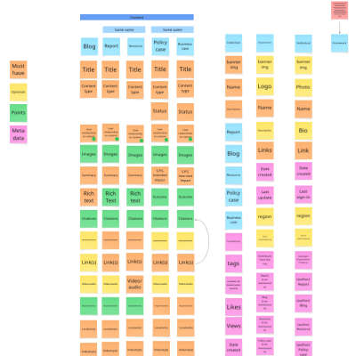
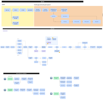
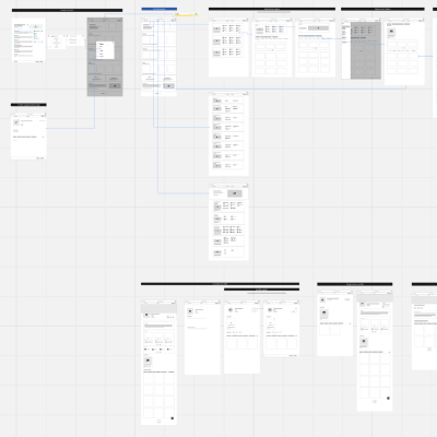
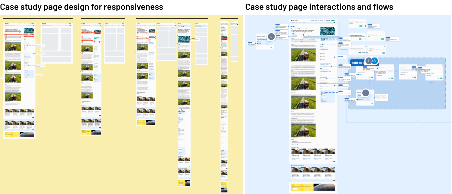
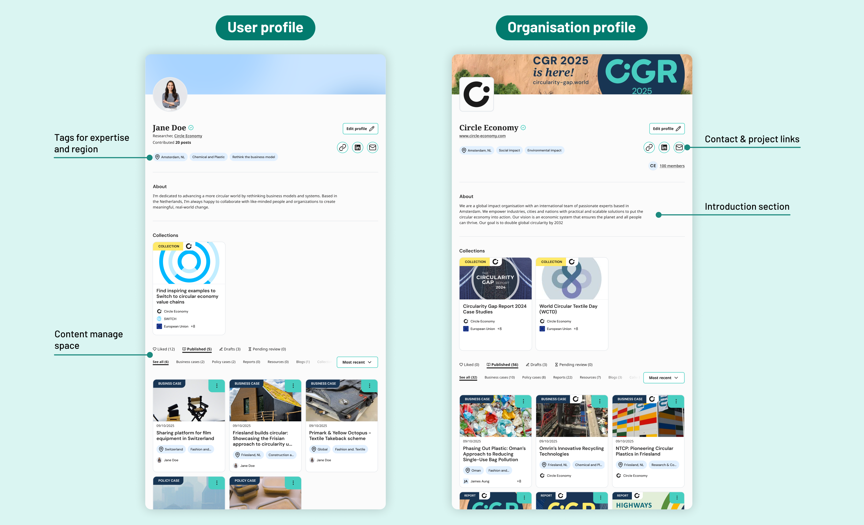
We built a strong design foundation through OOUX, wireframing, and a scalable design system with responsive variables. We also delivered clear, structured Figma documentation covering components, interactions, responsiveness, and accessibility. This reduced developer handover time and, by establishing documentation habits early, helped the team stay consistent even under time pressure.
What could be improved:
Centrailised decision tracking
Product requirements and decision-making were spread across multiple tools, making it difficult to trace decisions over time. A single source of truth documenting all decisions, even small ones, would have improved clarity and continuity.
