Redesign Picnic
Client

UX Researcher
JingYi Chao
Lars Behnke
Feb-Jun 2023
Miro
Redesign Picnic

Feb-Jun 2023
ROLE
UXUI Design
UX research
TEAM
Sophia Chou
JingYi Chao
Lars Behnke
Figma
Miro
A redesigned Picnic App with an intuitive layout, personalised content, and a new planning feature aims to make the lives of busy families easier.
Improved usability of the Discover and Search pages, leading to error-free performance by all 6 participants in evaluation tests.
Designed feature, the Meal Planner, resulted in all 6 participants reporting a high willingness to use it.
Family with young kids

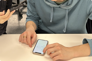
Participants
- Participant recruiting criteria: a person who has kids and mainly does grocery shopping for the family.
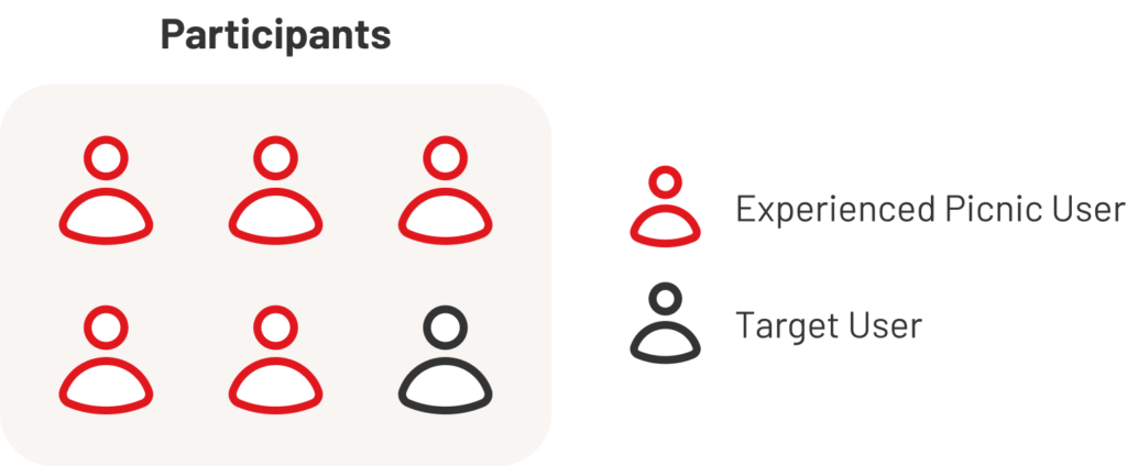
- 7 participants (2 Picnic users and 5 novice users)
Procedure
1. Pre-test interview
- Demographic questions
- Impression of Picnic
- Grocery shopping habit
2. Tasks
Imagine using Picnic to shop for groceries for the rest of the week.
Include these items in the order:
- 1 product from another country
- 1 discounted item
- 1 recipe
3. Post-test interview
- Frustrations while using the app
- Favourite points of the app
- Overall feedback
4. BERT questionnaire
Use a BERT (Bipolar Emotional Response Test) questionnaire to evaluate their experience on a 5-point Likert scale, measuring six pairs of adjectives.
- Easy v.s. Complicated
- Friendly v.s Authoritarian
- Useful v.s Unnecessary
- Budget v.s. Premium
- Intuitive v.s Confusing
- Personal v.s. Formal
1. Pre-test interview
- Demographic questions
- Impression of Picnic
- Grocery shopping habit
2. Tasks
Imagine using Picnic to shop for groceries for the rest of the week
Include these items in the order:
- 1 product from another country
- 1 discounted item
- 1 recipe
3. Post-test interview
- Frustrations while using the app
- Favourite points of the app
- Overall feedback
4. BERT questionnaire
Use a BERT (Bipolar Emotional Response Test) questionnaire to evaluate their experience on a 5-point Likert scale, measuring six pairs of adjectives.
- Easy v.s. Complicated
- Friendly v.s Authoritarian
- Useful v.s Unnecessary
- Budget v.s. Premium
- Intuitive v.s Confusing
- Personal v.s. Formal

Participants
- Participant recruiting criteria: a person who has kids and mainly does grocery shopping for the family.
- 8 participants (included non online grocery shoppers, occasional online shoppers, and long term frequent online grocery shoppers)
Procedure
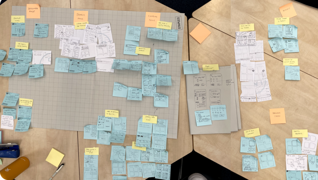
We visited the public library of Delft and targeted parents with children to conduct a 5-10 min short interview about their grocery shopping habits. The interview questions were as below:
- General Information
- How many people do you do groceries for
- Shopping Habits
- How often do you usually do one grocery shopping?
- How long does it take? How does that make you feel?
- Do you usually make a fix shopping list beforehand? Why or why not?
- Online/In-store Shopping Preference
- Do you use any online grocery shopping service?
- If yes, do you still go to physical stores?
- Values
- What criteria or preferences does your shopping base on?
- Do you have any shopping behavior that you think is worth changing?
Prefer healthier products while staying within budget
Frequent and fixed shopping schedule
Could improve on intuitiveness and personalization
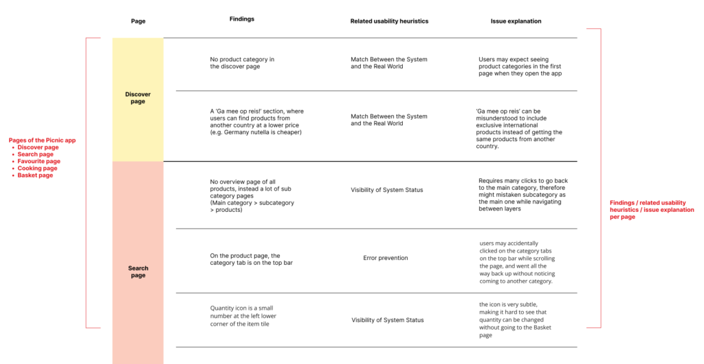
Usability issue
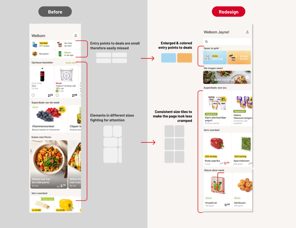
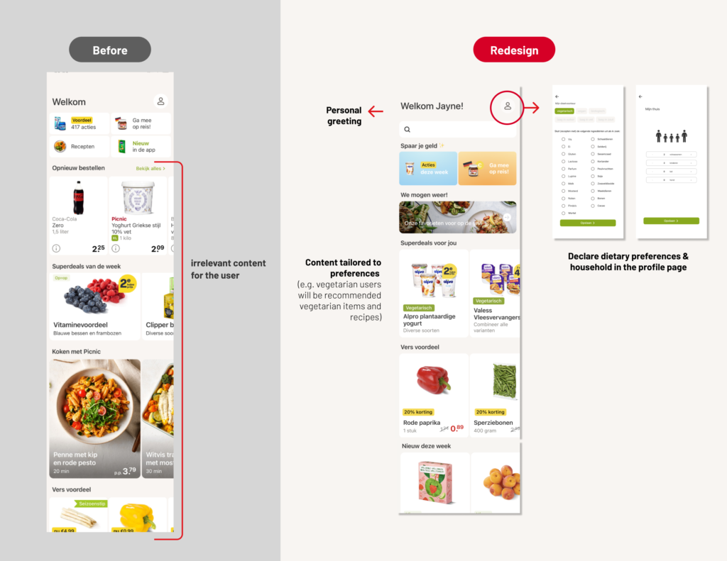
Cramped and irrelevant layout limits Discover Page engagement
Usability issue
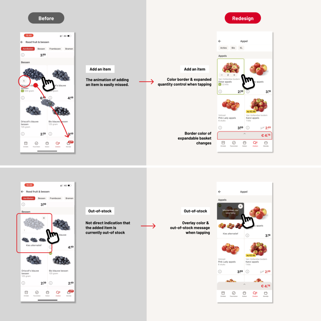
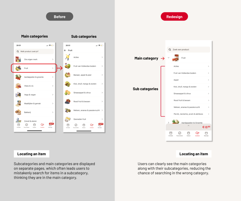
Struggles locating and adding correct items
Participant think aloud
Interview
Observation
Questionnaire
Users can keep track of what they have added without having to navigate to the Basket page.
Count the amount of times the participant navigates to the Basket page.
Q: The feedback of adding a product was clear to me (rate 1-4).
Users can locate a product without navigating to the wrong category more than once.
Count in how many tries the participant finds the right category.
Q: I know where I am in the app at all time (rate 1-4).
Users can find what they want on the Discover Page without excessive scrolling or overlooking.
Observe whether the participant immediately notices the entry point to international products, located on the Discover page.
Q:I think the contents in the Discover Page are in line with my personal preferences.
Q: The Discover Page is intuitive to use.
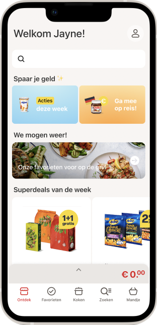
Redesigned Discover Page
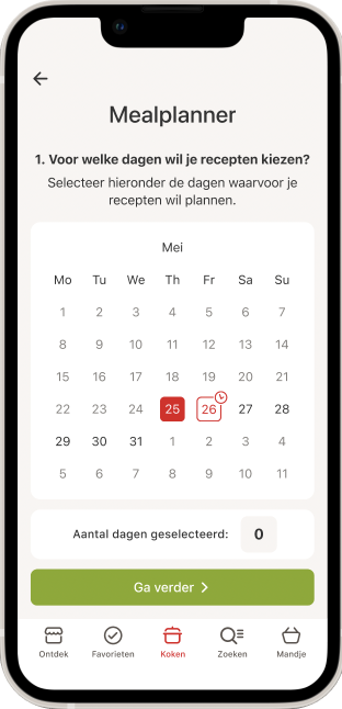
New feature Meal Planner
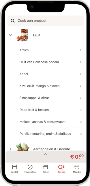
Redesigned Search Page
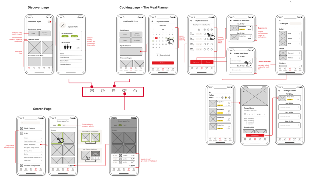
The final design proposal includes redesigned features located in the discover page, the search page, and a new planning feature in the cooking page.
Redesign Discover Page

The Meal Planner
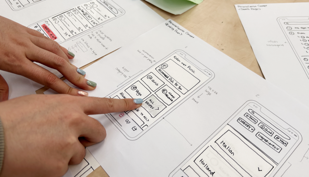
The Meal Planner is a new feature we designed, that is located in the Cooking Page. With the Meal Planner, users are able to plan and order their groceries in a more structured and guided manner.
Plan your future meals by your own
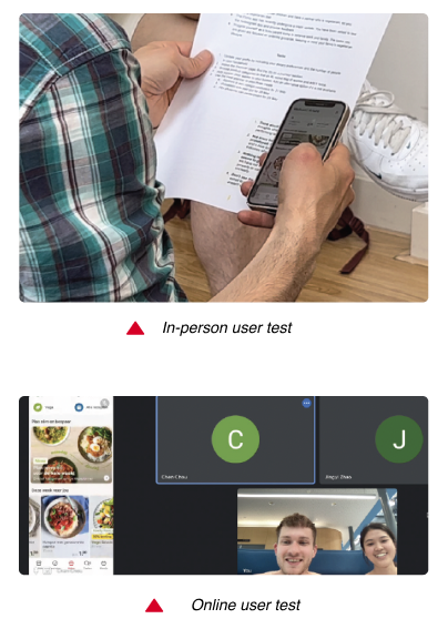
After finalizing the final redesign proposal, we tested the Figma prototype with participants where we gave them tasks. To evaluate whether the testable targets were achieved and gather users’ feedback, evaluation mentioned above were applied, including participant thinking aloud, observation, interviews and a questionnaire.
Testable Target 01
Users can keep track of what they have added without having to navigate to the Basket Page.
The statement ‘The feedback of adding a product was clear to me.’ was scored 3.83/4, which is the highest score in the questionnaire.
Observation & Interview
The task of adding items from the search page went smoothly for each participant. 1 participant particularly noticed the border color changed after adding the item, and gave positive comment.
“The edges around changes color, it’s now more visible.”
– participant 6
Testable Target 02
Users can locate a product without navigating to the wrong category more than once.
From observation, all 6 participants chose the right category without hesitation and any mistake.
Questionnaire result
The corresponding questionnaire statement ‘I know where I am in the app at all time’, received relatively low score. 1 participant mentioned it was because the prototype was not fully developed. Buttons and pages that are not clickable caused frustration.
Testable Target 03
Users can find what they want on the Discover page without excessive scrolling or overlooking.
The dietary declaration in the profile page was helpful especially for participants with specific dietary needs. Participants noticed the content is tailored to their needs and think it’s more convenient for them.
“I like that I can put in my dietary preferences. It’s convenient, because I am vegetarian myself, so it can pick out what I don’t want to see anyways.”-participant 2
All participants expressed a positive impression for the Meal Planner. Both the “surprise me” and the “choose manually” options were said to be time saving for planning their weekly meals.
The interface and procedure are easy to use and understand

