Circle Economy Design System

Company

Circle Economy

TIME

2025

Team

Sophia Chou: Product Designer
Lauren Zemering: Product Design Lead
Isfaaq Goomany: Dev lead
Mahima Ramgolam: Frontend developer

Tool

Figma

Circle Economy
Design System
COMPANY Circle Economy
TEAM
Sophia Chou: Product Designer
Lauren Zemering: Product Design Lead
Isfaaq Goomany: Dev Lead
Mahima Ramgolam: Frontend developer

TIME
2025

Tool


Figma

Deliverable
Delivered a core design system including reusable UI components, design tokens, and documentation that serves as a scalable source of truth for all Circle Economy products.
Impact

Improved consistency across Circle Economy's platform and made design work more efficient.

Established shared standards and components across development workflows, supporting more cohesive product development.

The Challenge
Building a unified design system with new branding

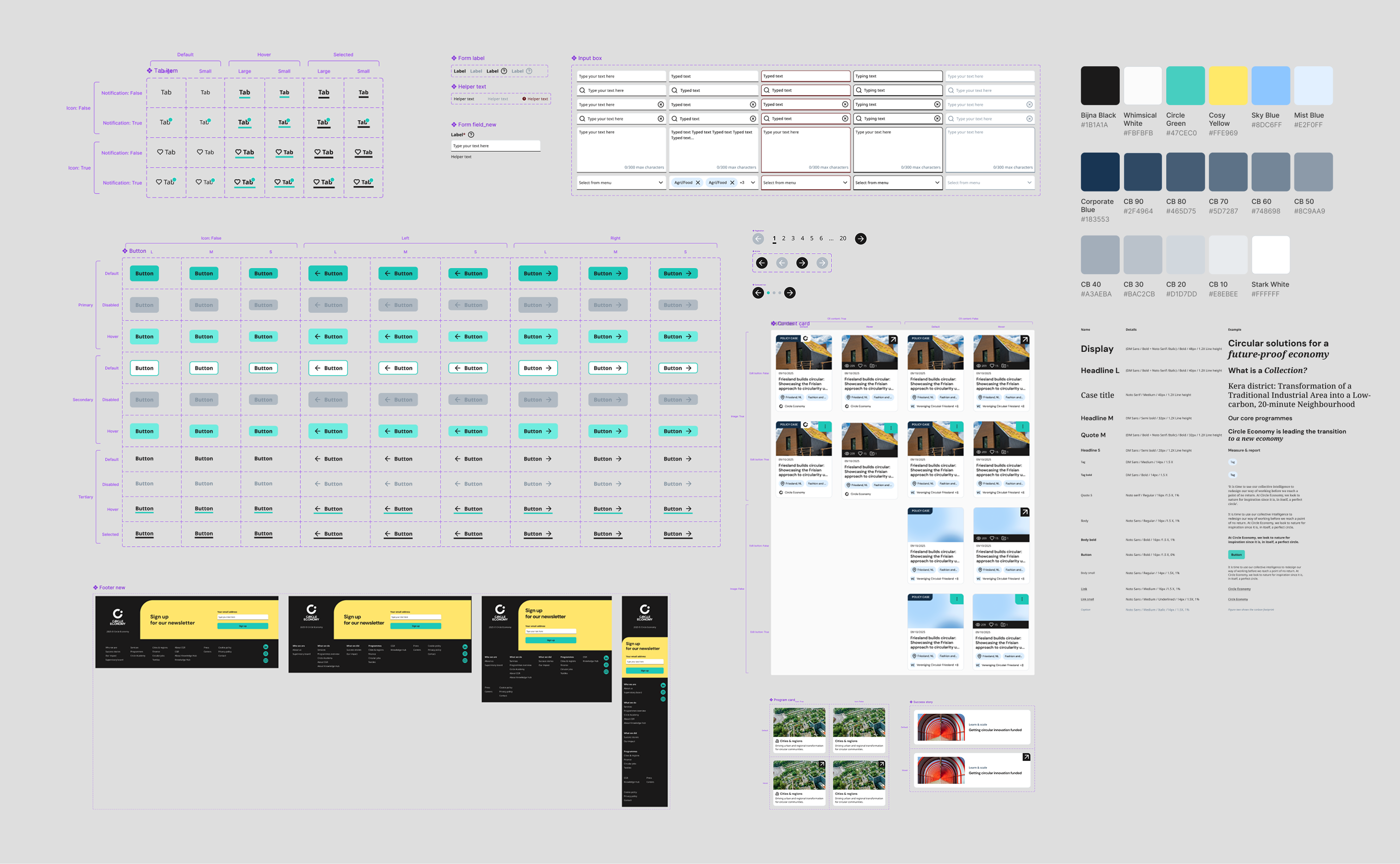
Circle Economy had several different design systems running across different products. As the company started moving toward a single unified platform, we needed one unified design system that could bring everything together and feel consistent. Before the development began, Circle Economy introduced a new brand identity, so we had to build the system based on the updated look and feel. With this challenge, us two designers worked closely to built this new design system.

Key things we did
1. Audit and define our typography
We began by auditing our current web pages to understand what typography we actually needed. We took inspiration from other design systems like Material, but since our products aren’t as complex, we didn’t need that many different type styles. So we reviewed the actual content from our corporate website and defined a sensible typography hierarchy. We then tested the new styles on the Knowledge Hub to make sure they also worked across products.
2. Move from styles to more scalable variables
In the past, Circle Economy’s design system relied on styles to define elements. After researching best practices, we rebuilt our foundations using variables. This helped us keep components consistent and makes future updates much easier. Also, with variables, we’re able to set up responsiveness easier. Throughout the process, we worked closely with developers to ensure their setup aligned with our design system.
3. Built components with accessibility in mind
When designing components, we made sure they at least met WCAG AA standards, considering color contrast, touch targets, and clearly defined states. During handover to developers, we also communicated important accessibility details such as tab order and focus behavior to ensure a consistent and usable experience for all users.
4. Core + Local: A tiered approach to design systems
Our unified core design system serves as the single source of truth for global tokens and foundational components. However, we needed more specialised, product-specific components to support different product needs. To solve this, we adopted a tiered library approach: each product maintains its own local design system built from core components and extended with product-specific patterns. This keeps consistency with the core system while accelerating product development. Components used across multiple products can be “promoted” to the core system. For example, during the Knowledge Hub revamp we created content cards in the local library, later realised they were also valuable for the corporate website and dashboard platform, we then moved them to the Core library for reuse across the ecosystem.
Overall approach
Iterating on the Design System as we go

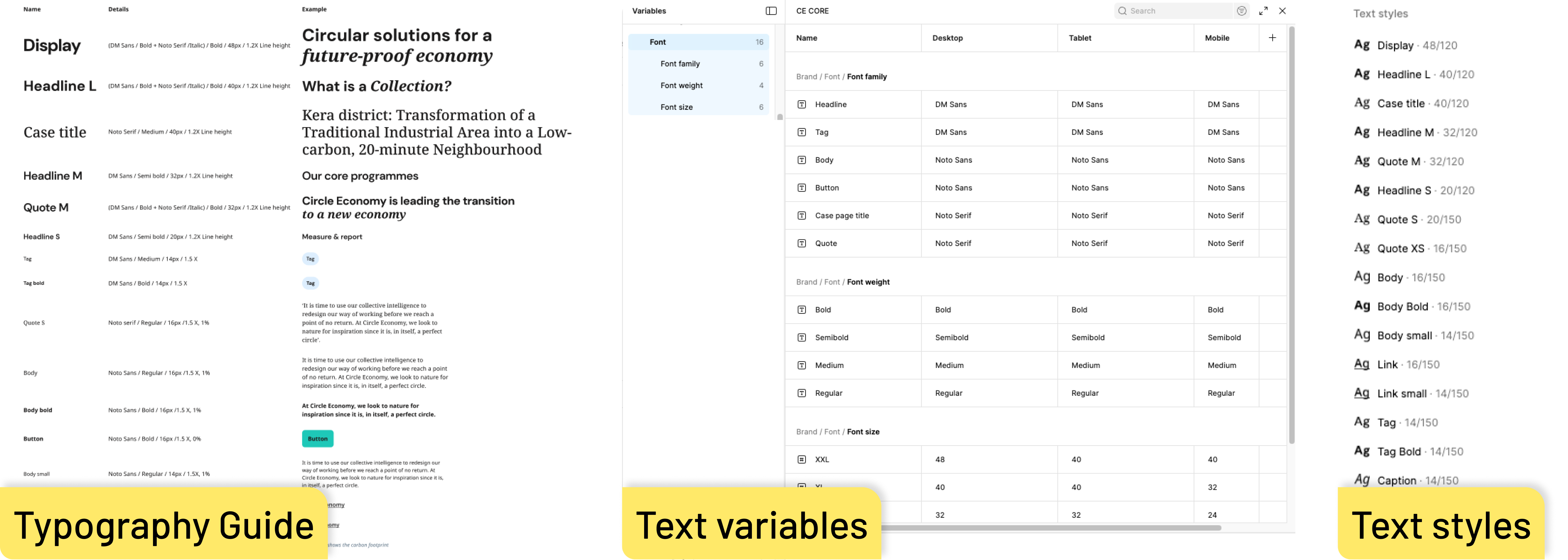
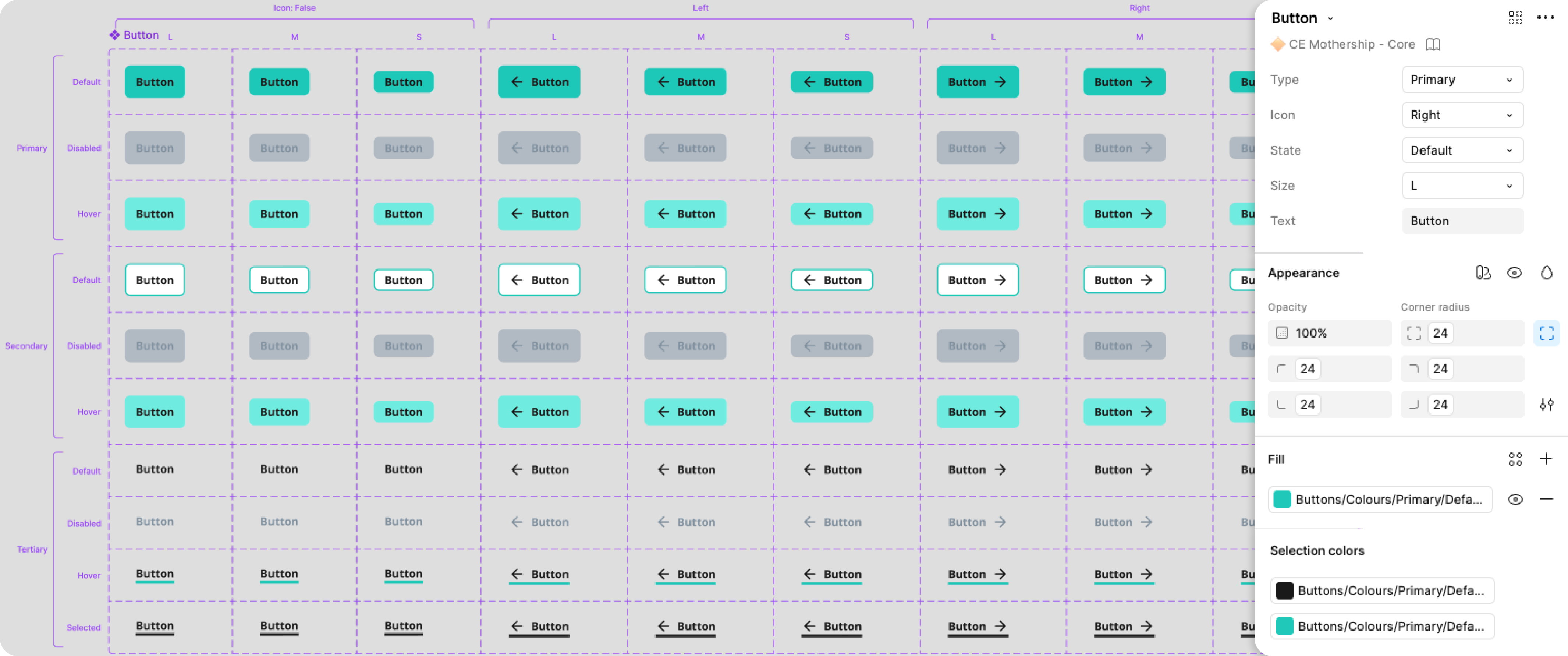
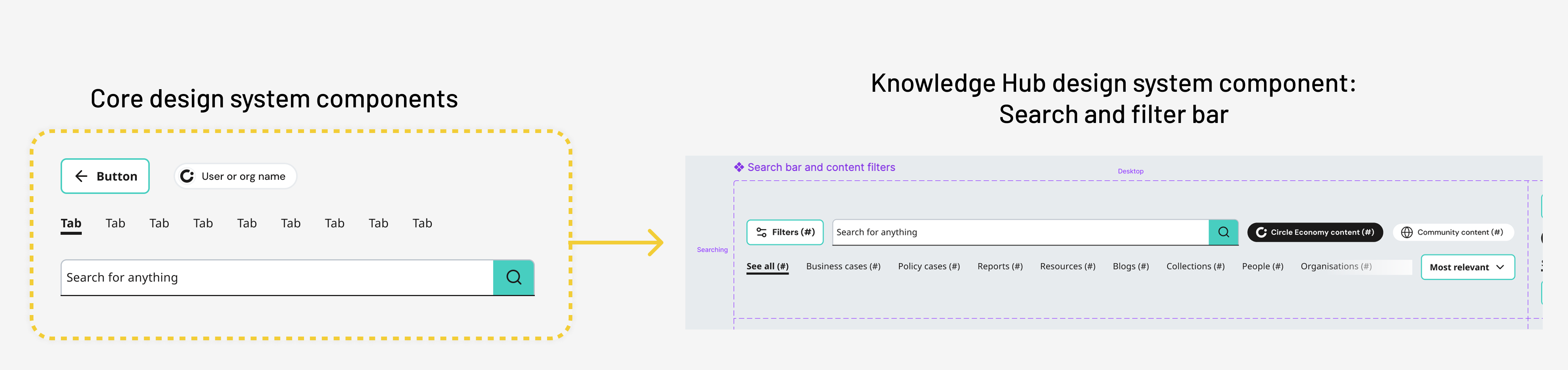
While developing this unified design system, we were also working on the corporate website, Knowledge Hub, and iterating the CGR Dashboard. With all these projects happening simultaneously, we kept the design system flexible and iterative. Along the way, we ran into challenges—like creating components that were too general, which often required overriding settings, or missing edge cases when building a component. Mistakes happen! But what matters is continuously learning and evolving the system.

Scroll to Top